Plotting
Note
Plotting will be under active development for August and September 2015.
Introduction
Labeled data enables expressive computations. These same labels can also be used to easily create informative plots.
Xray’s plotting capabilities are centered around xray.DataArray objects. To plot xray.Dataset objects simply access the relevant DataArrays, ie dset['var1'].
Xray plotting functionality is a thin wrapper around the popular matplotlib library. Matplotlib syntax and function names were copied as much as possible, which makes for an easy transition between the two. Matplotlib must be installed before xray can plot.
For more extensive plotting applications consider the following projects:
- Seaborn: “provides a high-level interface for drawing attractive statistical graphics.” Integrates well with pandas.
- Holoviews: “Composable, declarative data structures for building even complex visualizations easily.” Works for 2d datasets.
- Cartopy: Provides cartographic tools.
Imports
The following imports are necessary for all of the examples.
In [3]: import numpy as np

In [4]: import matplotlib.pyplot as plt

In [5]: import xray
We’ll use the North American air temperature dataset.
In [6]: airtemps = xray.tutorial.load_dataset('air_temperature')

In [7]: airtemps
 Out[7]:
<xray.Dataset>
Dimensions:  (lat: 25, lon: 53, time: 2920)
Coordinates:
  * lat      (lat) float32 75.0 72.5 70.0 67.5 65.0 62.5 60.0 57.5 55.0 52.5 ...
  * time     (time) datetime64[ns] 2013-01-01 2013-01-01T06:00:00 ...
  * lon      (lon) float32 200.0 202.5 205.0 207.5 210.0 212.5 215.0 217.5 ...
Data variables:
    air      (time, lat, lon) float64 241.2 242.5 243.5 244.0 244.1 243.9 ...
Attributes:
    platform: Model
    Conventions: COARDS
    references: http://www.esrl.noaa.gov/psd/data/gridded/data.ncep.reanalysis.html
    description: Data is from NMC initialized reanalysis
(4x/day).  These are the 0.9950 sigma level values.
    title: 4x daily NMC reanalysis (1948)

# Convert to celsius
In [8]: air = airtemps.air - 273.15
One Dimension
Simple Example
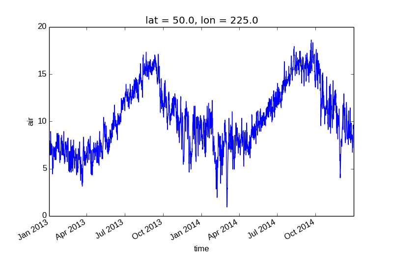
Xray uses the coordinate name to label the x axis.
In [9]: air1d = air.isel(lat=10, lon=10)

In [10]: air1d.plot()
Out[10]: [<matplotlib.lines.Line2D at 0x7fc010ca30d0>]
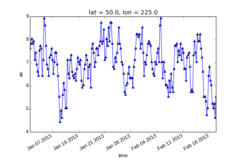
Additional Arguments
Additional arguments are passed directly to the matplotlib function which does the work. For example, xray.plot.line() calls matplotlib.pyplot.plot passing in the index and the array values as x and y, respectively. So to make a line plot with blue triangles a matplotlib format string can be used:
In [11]: air1d[:200].plot.line('b-^')
Out[11]: [<matplotlib.lines.Line2D at 0x7fc011a7ad50>]
Note
Not all xray plotting methods support passing positional arguments to the wrapped matplotlib functions, but they do all support keyword arguments.
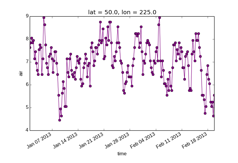
Keyword arguments work the same way, and are more explicit.
In [12]: air1d[:200].plot.line(color='purple', marker='o')
Out[12]: [<matplotlib.lines.Line2D at 0x7fc010d2b5d0>]
Adding to Existing Axis
To add the plot to an existing axis pass in the axis as a keyword argument ax. This works for all xray plotting methods. In this example axes is an array consisting of the left and right axes created by plt.subplots.
In [13]: fig, axes = plt.subplots(ncols=2)

In [14]: axes
Out[14]:
array([<matplotlib.axes.AxesSubplot object at 0x7fc0107b12d0>,
       <matplotlib.axes.AxesSubplot object at 0x7fc01077f190>], dtype=object)

In [15]: air1d.plot(ax=axes[0])
Out[15]: [<matplotlib.lines.Line2D at 0x7fc010821410>]

In [16]: air1d.plot.hist(ax=axes[1])
Out[16]:
(array([   9.,   38.,  255.,  584.,  542.,  489.,  368.,  258.,  327.,   50.]),
 array([  0.95 ,   2.719,   4.488, ...,  15.102,  16.871,  18.64 ]),
 <a list of 10 Patch objects>)

In [17]: plt.tight_layout()

In [18]: plt.show()
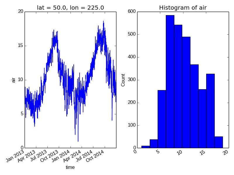
On the right is a histogram created by xray.plot.hist().
Two Dimensions
Simple Example
The default method xray.DataArray.plot() sees that the data is 2 dimensional. If the coordinates are uniformly spaced then it calls xray.plot.imshow().
In [19]: air2d = air.isel(time=500)

In [20]: air2d.plot()
Out[20]: <matplotlib.image.AxesImage at 0x7fc01051f350>
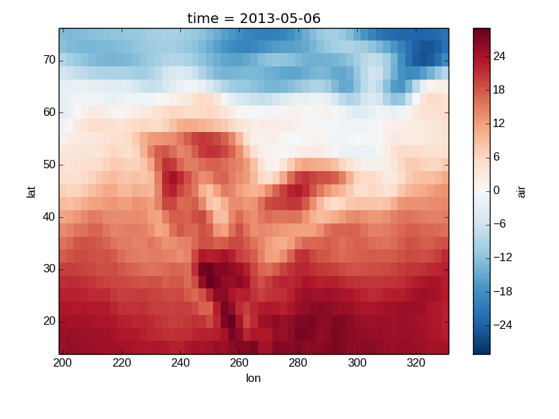
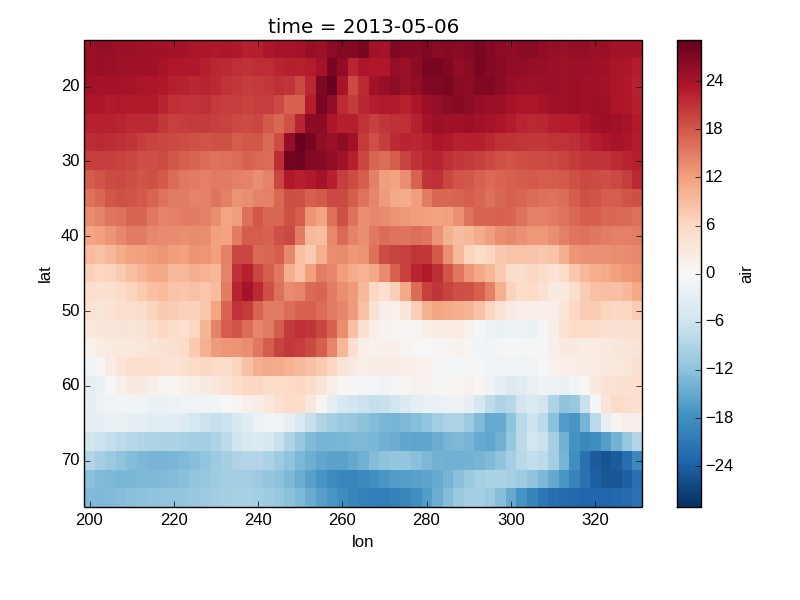
All 2d plots in xray allow the use of the keyword arguments yincrease and xincrease.
In [21]: air2d.plot(yincrease=False)
Out[21]: <matplotlib.image.AxesImage at 0x7fc0104b3e50>
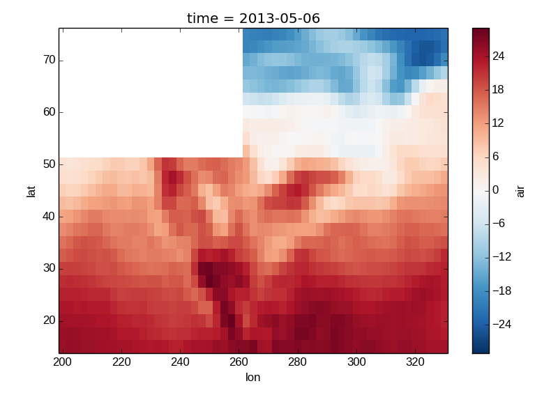
Missing Values
Xray plots data with Missing values.
In [22]: bad_air2d = air2d.copy()

In [23]: bad_air2d[dict(lat=slice(0, 10), lon=slice(0, 25))] = np.nan

In [24]: bad_air2d.plot()
Out[24]: <matplotlib.image.AxesImage at 0x7fc0110b1850>
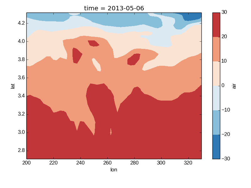
Nonuniform Coordinates
It’s not necessary for the coordinates to be evenly spaced. If not, then xray.DataArray.plot() produces a filled contour plot by calling xray.plot.contourf().
In [25]: b = air2d.copy()

# Apply a nonlinear transformation to one of the coords
In [26]: b.coords['lat'] = np.log(b.coords['lat'])

In [27]: b.plot()
Out[27]: <matplotlib.contour.QuadContourSet instance at 0x7fc010b248c0>
Calling Matplotlib
Since this is a thin wrapper around matplotlib, all the functionality of matplotlib is available.
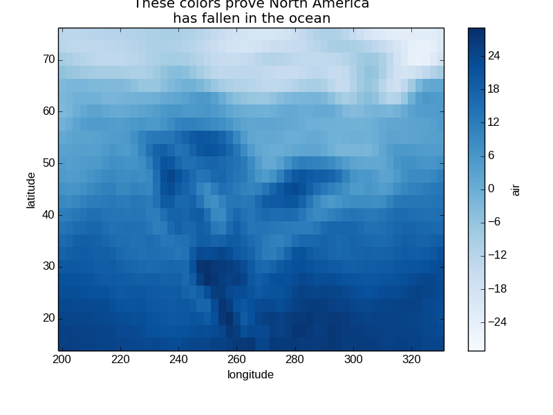
In [28]: air2d.plot(cmap=plt.cm.Blues)
Out[28]: <matplotlib.image.AxesImage at 0x7fc0103dca10>

In [29]: plt.title('These colors prove North America\nhas fallen in the ocean')
Out[29]: <matplotlib.text.Text at 0x7fc01034d9d0>

In [30]: plt.ylabel('latitude')
Out[30]: <matplotlib.text.Text at 0x7fc0103d7510>

In [31]: plt.xlabel('longitude')
Out[31]: <matplotlib.text.Text at 0x7fc0104bcd10>

In [32]: plt.show()
Note
Xray methods update label information and generally play around with the axes. So any kind of updates to the plot should be done after the call to the xray’s plot. In the example below, plt.xlabel effectively does nothing, since d_ylog.plot() updates the xlabel.
In [33]: plt.xlabel('Never gonna see this.')
Out[33]: <matplotlib.text.Text at 0x7fc010356290>

In [34]: air2d.plot()
Out[34]: <matplotlib.image.AxesImage at 0x7fc011e63f10>

In [35]: plt.show()

Colormaps
Xray borrows logic from Seaborn to infer what kind of color map to use. For example, consider the original data in Kelvins rather than Celsius:
In [36]: airtemps.air.isel(time=0).plot()
Out[36]: <matplotlib.image.AxesImage at 0x7fc010150d90>
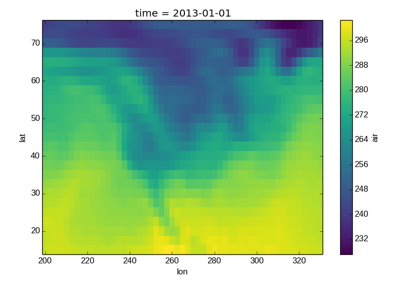
The Celsius data contain 0, so a diverging color map was used. The Kelvins do not have 0, so the default color map was used.
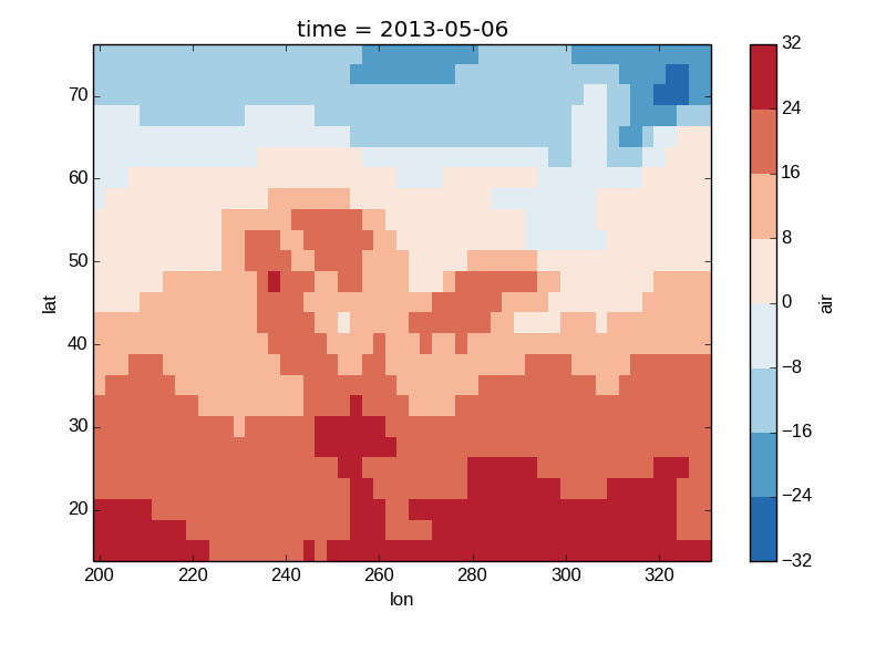
Discrete Colormaps
It is often useful, when visualizing 2d data, to use a discrete colormap, rather than the default continuous colormaps that matplotlib uses. The levels keyword argument can be used to generate plots with discrete colormaps. For example, to make a plot with 8 discrete color intervals:
In [37]: air2d.plot(levels=8)
Out[37]: <matplotlib.image.AxesImage at 0x7fc0100795d0>
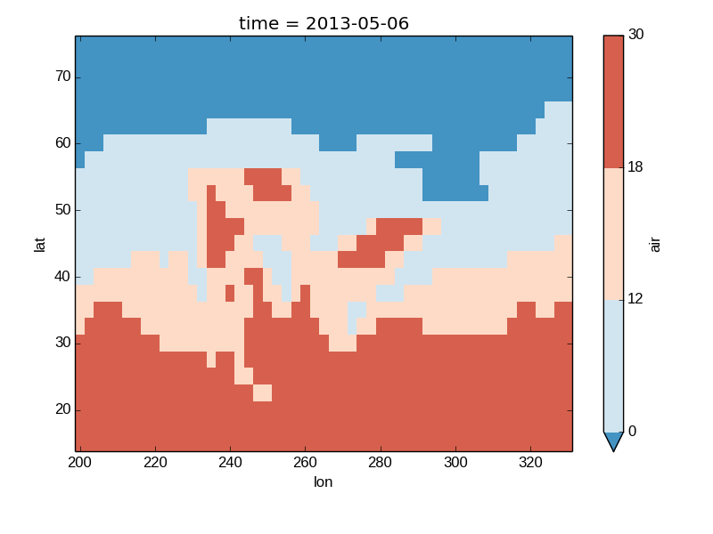
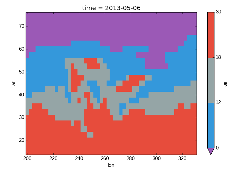
It is also possible to use a list of levels to specify the boundaries of the discrete colormap:
In [38]: air2d.plot(levels=[0, 12, 18, 30])
Out[38]: <matplotlib.image.AxesImage at 0x7fc00a898410>
Finally, if you have Seaborn installed, you can also specify a seaborn color palete or a list of colors as the cmap argument:
In [39]: flatui = ["#9b59b6", "#3498db", "#95a5a6", "#e74c3c", "#34495e", "#2ecc71"]

In [40]: air2d.plot(levels=[0, 12, 18, 30], cmap=flatui)
Out[40]: <matplotlib.image.AxesImage at 0x7fc010df5210>
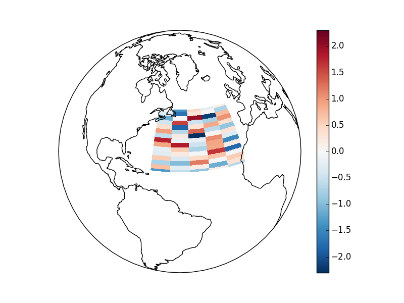
Maps
TODO - Update this example to use the tutorial data.
To follow this section you’ll need to have Cartopy installed and working.
This script will plot an image over the Atlantic ocean.
import xray
import numpy as np
import matplotlib.pyplot as plt
import cartopy.crs as ccrs

nlat = 15
nlon = 5
arr = np.random.randn(nlat, nlon)
arr[0, 0] = np.nan
atlantic = xray.DataArray(arr,
        coords = (np.linspace(50, 20, nlat), np.linspace(-60, -20, nlon)),
        dims = ('latitude', 'longitude'))

ax = plt.axes(projection=ccrs.Orthographic(-50, 30))

atlantic.plot(ax=ax, origin='upper', aspect='equal',
              transform=ccrs.PlateCarree())

ax.set_global()
ax.coastlines()

plt.savefig('atlantic_noise.png')
Here is the resulting image:
Details
Ways to Use
There are three ways to use the xray plotting functionality:
- Use plot as a convenience method for a DataArray.
- Access a specific plotting method from the plot attribute of a DataArray.
- Directly from the xray plot submodule.
These are provided for user convenience; they all call the same code.
In [41]: import xray.plot as xplt

In [42]: da = xray.DataArray(range(5))

In [43]: fig, axes = plt.subplots(ncols=2, nrows=2)

In [44]: da.plot(ax=axes[0, 0])
Out[44]: [<matplotlib.lines.Line2D at 0x7fc00a716f10>]

In [45]: da.plot.line(ax=axes[0, 1])
Out[45]: [<matplotlib.lines.Line2D at 0x7fc0110b3b50>]

In [46]: xplt.plot(da, ax=axes[1, 0])
Out[46]: [<matplotlib.lines.Line2D at 0x7fc00a5eb310>]

In [47]: xplt.line(da, ax=axes[1, 1])
Out[47]: [<matplotlib.lines.Line2D at 0x7fc011a26e50>]

In [48]: plt.tight_layout()

In [49]: plt.show()
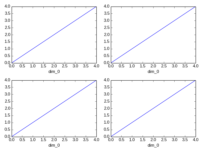
Here the output is the same. Since the data is 1 dimensional the line plot was used.
The convenience method xray.DataArray.plot() dispatches to an appropriate plotting function based on the dimensions of the DataArray and whether the coordinates are sorted and uniformly spaced. This table describes what gets plotted:
| Dimensions | Coordinates | Plotting function |
| 1 | xray.plot.line() | |
| 2 | Uniform | xray.plot.imshow() |
| 2 | Irregular | xray.plot.contourf() |
| Anything else | xray.plot.hist() |
Coordinates
If you’d like to find out what’s really going on in the coordinate system, read on.
In [50]: a0 = xray.DataArray(np.zeros((4, 3, 2)), dims=('y', 'x', 'z'),
   ....:          name='temperature')
   ....:

In [51]: a0[0, 0, 0] = 1

In [52]: a = a0.isel(z=0)

In [53]: a
Out[53]:
<xray.DataArray 'temperature' (y: 4, x: 3)>
array([[ 1.,  0.,  0.],
       [ 0.,  0.,  0.],
       [ 0.,  0.,  0.],
       [ 0.,  0.,  0.]])
Coordinates:
  * x        (x) int64 0 1 2
  * y        (y) int64 0 1 2 3
    z        int64 0
The plot will produce an image corresponding to the values of the array. Hence the top left pixel will be a different color than the others. Before reading on, you may want to look at the coordinates and think carefully about what the limits, labels, and orientation for each of the axes should be.
In [54]: a.plot()
Out[54]: <matplotlib.image.AxesImage at 0x7fc00a4d8990>
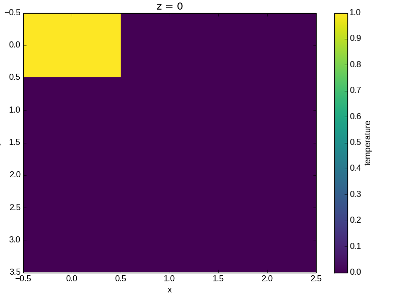
It may seem strange that the values on the y axis are decreasing with -0.5 on the top. This is because the pixels are centered over their coordinates, and the axis labels and ranges correspond to the values of the coordinates.