Toy weather data
Here is an example of how to easily manipulate a toy weather dataset using xray and other recommended Python libraries:
Shared setup:
import xray
import numpy as np
import pandas as pd
import seaborn as sns # pandas aware plotting library

np.random.seed(123)

times = pd.date_range('2000-01-01', '2001-12-31', name='time')
annual_cycle = np.sin(2 * np.pi * (times.dayofyear / 365.25 - 0.28))

base = 10 + 15 * annual_cycle.reshape(-1, 1)
tmin_values = base + 3 * np.random.randn(annual_cycle.size, 3)
tmax_values = base + 10 + 3 * np.random.randn(annual_cycle.size, 3)

ds = xray.Dataset({'tmin': (('time', 'location'), tmin_values),
                   'tmax': (('time', 'location'), tmax_values)},
                  {'time': times, 'location': ['IA', 'IN', 'IL']})
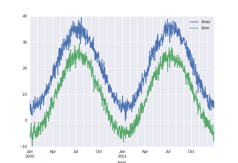
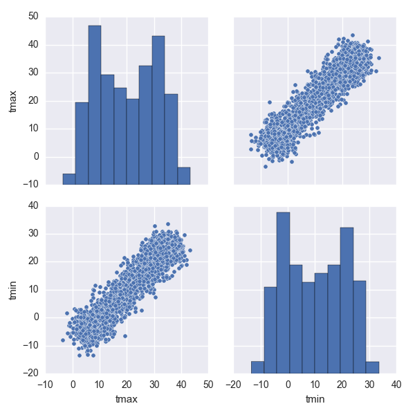
Examine a dataset with pandas and seaborn
In [1]: ds
Out[1]:
<xray.Dataset>
Dimensions:   (location: 3, time: 731)
Coordinates:
  * location  (location) |S2 'IA' 'IN' 'IL'
  * time      (time) datetime64[ns] 2000-01-01 2000-01-02 2000-01-03 ...
Data variables:
    tmax      (time, location) float64 12.98 3.31 6.779 0.4479 6.373 4.843 ...
    tmin      (time, location) float64 -8.037 -1.788 -3.932 -9.341 -6.558 ...

In [2]: df = ds.to_dataframe()

In [3]: df.head()
Out[3]:
                          tmax       tmin
location time
IA       2000-01-01  12.980549  -8.037369
         2000-01-02   0.447856  -9.341157
         2000-01-03   5.322699 -12.139719
         2000-01-04   1.889425  -7.492914
         2000-01-05   0.791176  -0.447129

In [4]: df.describe()
Out[4]:
              tmax         tmin
count  2193.000000  2193.000000
mean     20.108232     9.975426
std      11.010569    10.963228
min      -3.506234   -13.395763
25%       9.853905    -0.040347
50%      19.967409    10.060403
75%      30.045588    20.083590
max      43.271148    33.456060

In [5]: ds.mean(dim='location').to_dataframe().plot()
Out[5]: <matplotlib.axes.AxesSubplot at 0x7f246244ac10>
In [6]: sns.pairplot(df.reset_index(), vars=ds.data_vars)
Out[6]: <seaborn.axisgrid.PairGrid at 0x7f0fd2368a10>
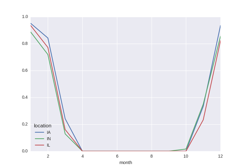
Probability of freeze by calendar month
In [7]: freeze = (ds['tmin'] <= 0).groupby('time.month').mean('time')

In [8]: freeze
Out[8]:
<xray.DataArray 'tmin' (month: 12, location: 3)>
array([[ 0.952,  0.887,  0.935],
       [ 0.842,  0.719,  0.772],
       [ 0.242,  0.129,  0.161],
       ...,
       [ 0.   ,  0.016,  0.   ],
       [ 0.333,  0.35 ,  0.233],
       [ 0.935,  0.855,  0.823]])
Coordinates:
  * month     (month) int64 1 2 3 4 5 6 7 8 9 10 11 12
  * location  (location) |S2 'IA' 'IN' 'IL'

In [9]: freeze.to_pandas().plot()
Out[9]: <matplotlib.axes.AxesSubplot at 0x7f245a101b50>
Monthly averaging
In [10]: monthly_avg = ds.resample('1MS', dim='time', how='mean')

In [11]: monthly_avg.sel(location='IA').to_dataframe().plot(style='s-')
Out[11]: <matplotlib.axes.AxesSubplot at 0x7f245a14f450>
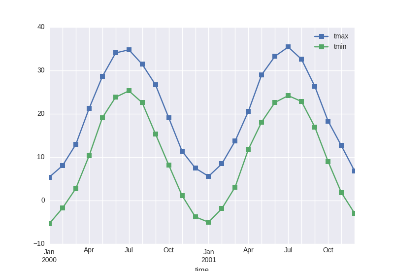
Note that MS here refers to Month-Start; M labels Month-End (the last day of the month).
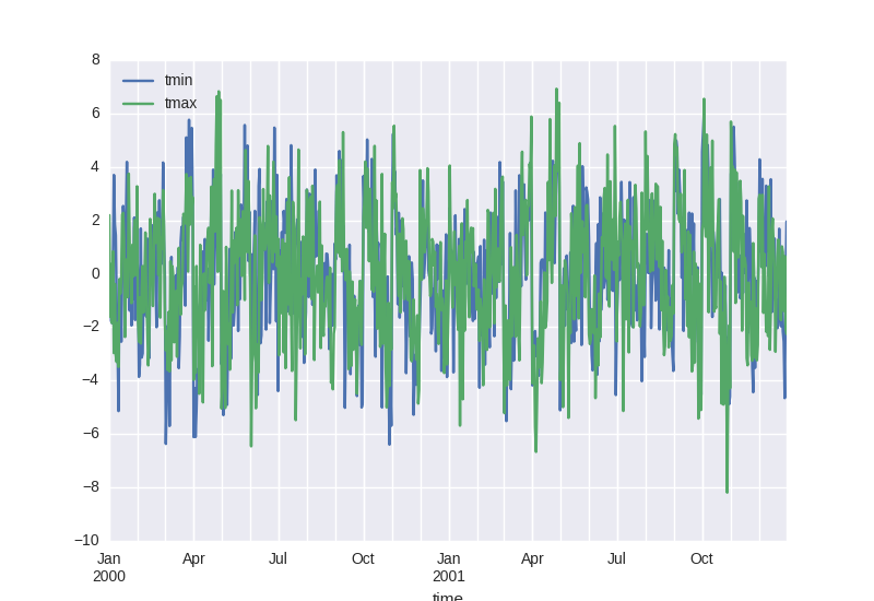
Calculate monthly anomalies
In climatology, “anomalies” refer to the difference between observations and typical weather for a particular season. Unlike observations, anomalies should not show any seasonal cycle.
In [12]: climatology = ds.groupby('time.month').mean('time')

In [13]: anomalies = ds.groupby('time.month') - climatology

In [14]: anomalies.mean('location').to_dataframe()[['tmin', 'tmax']].plot()
Out[14]: <matplotlib.axes.AxesSubplot at 0x7f245a10bc10>
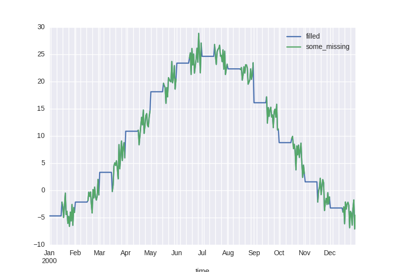
Fill missing values with climatology
The fillna() method on grouped objects lets you easily fill missing values by group:
# throw away the first half of every month
In [15]: some_missing = ds.tmin.sel(time=ds['time.day'] > 15).reindex_like(ds)

In [16]: filled = some_missing.groupby('time.month').fillna(climatology.tmin)

In [17]: both = xray.Dataset({'some_missing': some_missing, 'filled': filled})

In [18]: both
Out[18]:
<xray.Dataset>
Dimensions:       (location: 3, time: 731)
Coordinates:
  * location      (location) object 'IA' 'IN' 'IL'
  * time          (time) datetime64[ns] 2000-01-01 2000-01-02 2000-01-03 ...
    month         (time) int32 1 1 1 1 1 1 1 1 1 1 1 1 1 1 1 1 1 1 1 1 1 1 1 ...
Data variables:
    some_missing  (time, location) float64 nan nan nan nan nan nan nan nan ...
    filled        (time, location) float64 -5.163 -4.216 -4.681 -5.163 ...

In [19]: df = both.sel(time='2000').mean('location').reset_coords(drop=True).to_dataframe()

In [20]: df[['filled', 'some_missing']].plot()
Out[20]: <matplotlib.axes.AxesSubplot at 0x7f2459ebae90>