Visualization Gallery
Contents
You can run this notebook in a live session ![]() or view it on Github.
or view it on Github.
Visualization Gallery#
This notebook shows common visualization issues encountered in xarray.
[1]:
import cartopy.crs as ccrs
import matplotlib.pyplot as plt
import xarray as xr

%matplotlib inline
Load example dataset:
[2]:
ds = xr.tutorial.load_dataset("air_temperature")
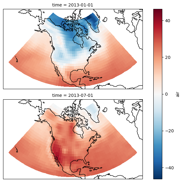
Multiple plots and map projections#
Control the map projection parameters on multiple axes
This example illustrates how to plot multiple maps and control their extent and aspect ratio.
For more details see this discussion on github.
[3]:
air = ds.air.isel(time=[0, 724]) - 273.15

# This is the map projection we want to plot *onto*
map_proj = ccrs.LambertConformal(central_longitude=-95, central_latitude=45)

p = air.plot(
    transform=ccrs.PlateCarree(),  # the data's projection
    col="time",
    col_wrap=1,  # multiplot settings
    aspect=ds.dims["lon"] / ds.dims["lat"],  # for a sensible figsize
    subplot_kws={"projection": map_proj},
)  # the plot's projection

# We have to set the map's options on all axes
for ax in p.axes.flat:
    ax.coastlines()
    ax.set_extent([-160, -30, 5, 75])
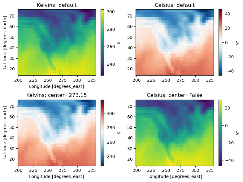
Centered colormaps#
Xarray’s automatic colormaps choice
[4]:
air = ds.air.isel(time=0)

f, ((ax1, ax2), (ax3, ax4)) = plt.subplots(2, 2, figsize=(8, 6))

# The first plot (in kelvins) chooses "viridis" and uses the data's min/max
air.plot(ax=ax1, cbar_kwargs={"label": "K"})
ax1.set_title("Kelvins: default")
ax2.set_xlabel("")

# The second plot (in celsius) now chooses "BuRd" and centers min/max around 0
airc = air - 273.15
airc.plot(ax=ax2, cbar_kwargs={"label": "°C"})
ax2.set_title("Celsius: default")
ax2.set_xlabel("")
ax2.set_ylabel("")

# The center doesn't have to be 0
air.plot(ax=ax3, center=273.15, cbar_kwargs={"label": "K"})
ax3.set_title("Kelvins: center=273.15")

# Or it can be ignored
airc.plot(ax=ax4, center=False, cbar_kwargs={"label": "°C"})
ax4.set_title("Celsius: center=False")
ax4.set_ylabel("")

# Make it nice
plt.tight_layout()
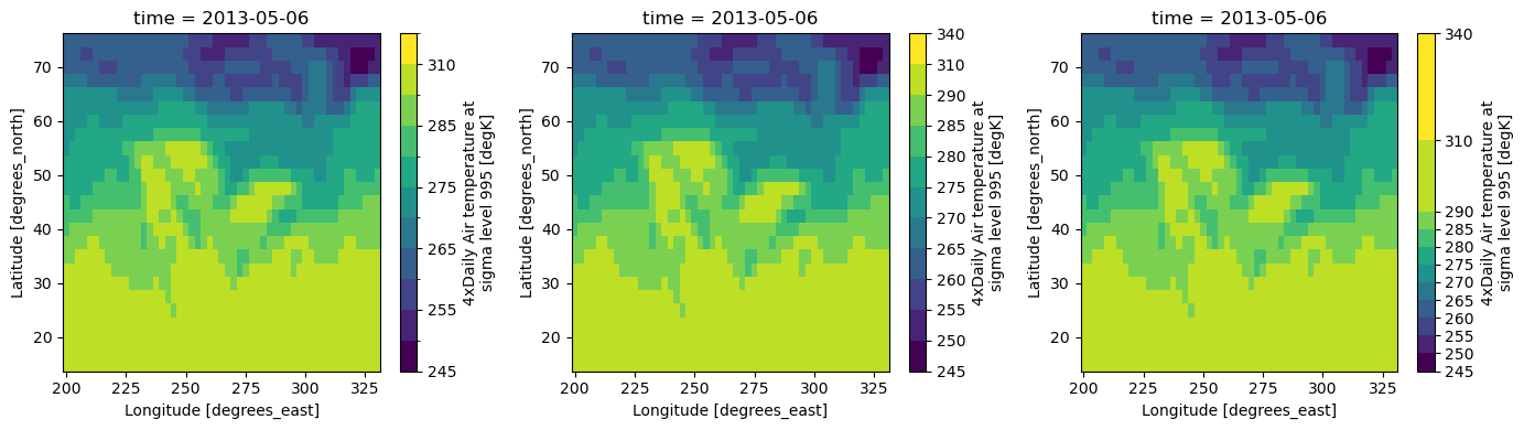
Control the plot’s colorbar#
Use cbar_kwargs keyword to specify the number of ticks. The spacing kwarg can be used to draw proportional ticks.
[5]:
air2d = ds.air.isel(time=500)

# Prepare the figure
f, (ax1, ax2, ax3) = plt.subplots(1, 3, figsize=(14, 4))

# Irregular levels to illustrate the use of a proportional colorbar
levels = [245, 250, 255, 260, 265, 270, 275, 280, 285, 290, 310, 340]

# Plot data
air2d.plot(ax=ax1, levels=levels)
air2d.plot(ax=ax2, levels=levels, cbar_kwargs={"ticks": levels})
air2d.plot(
    ax=ax3, levels=levels, cbar_kwargs={"ticks": levels, "spacing": "proportional"}
)

# Show plots
plt.tight_layout()
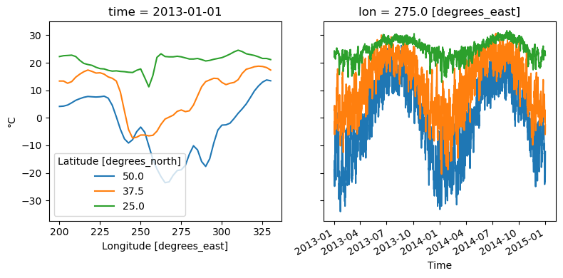
Multiple lines from a 2d DataArray#
Use xarray.plot.line on a 2d DataArray to plot selections as multiple lines.
See plotting.multiplelines for more details.
[6]:
air = ds.air - 273.15  # to celsius

# Prepare the figure
f, (ax1, ax2) = plt.subplots(1, 2, figsize=(8, 4), sharey=True)

# Selected latitude indices
isel_lats = [10, 15, 20]

# Temperature vs longitude plot - illustrates the "hue" kwarg
air.isel(time=0, lat=isel_lats).plot.line(ax=ax1, hue="lat")
ax1.set_ylabel("°C")

# Temperature vs time plot - illustrates the "x" and "add_legend" kwargs
air.isel(lon=30, lat=isel_lats).plot.line(ax=ax2, x="time", add_legend=False)
ax2.set_ylabel("")

# Show
plt.tight_layout()
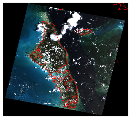
imshow() and rasterio map projections#
Using rasterio’s projection information for more accurate plots.
This example extends recipes.rasterio and plots the image in the original map projection instead of relying on pcolormesh and a map transformation.
[7]:
da = xr.tutorial.open_rasterio("RGB.byte")

# The data is in UTM projection. We have to set it manually until
# https://github.com/SciTools/cartopy/issues/813 is implemented
crs = ccrs.UTM("18")

# Plot on a map
ax = plt.subplot(projection=crs)
da.plot.imshow(ax=ax, rgb="band", transform=crs)
ax.coastlines("10m", color="r")
[7]:
<cartopy.mpl.feature_artist.FeatureArtist at 0x7ffa209a79d0>
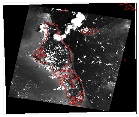
Parsing rasterio geocoordinates#
Converting a projection’s cartesian coordinates into 2D longitudes and latitudes.
These new coordinates might be handy for plotting and indexing, but it should be kept in mind that a grid which is regular in projection coordinates will likely be irregular in lon/lat. It is often recommended to work in the data’s original map projection (see recipes.rasterio_rgb).
[8]:
from pyproj import Transformer
import numpy as np

da = xr.tutorial.open_rasterio("RGB.byte")

x, y = np.meshgrid(da["x"], da["y"])
transformer = Transformer.from_crs(da.crs, "EPSG:4326", always_xy=True)
lon, lat = transformer.transform(x, y)
da.coords["lon"] = (("y", "x"), lon)
da.coords["lat"] = (("y", "x"), lat)

# Compute a greyscale out of the rgb image
greyscale = da.mean(dim="band")

# Plot on a map
ax = plt.subplot(projection=ccrs.PlateCarree())
greyscale.plot(
    ax=ax,
    x="lon",
    y="lat",
    transform=ccrs.PlateCarree(),
    cmap="Greys_r",
    shading="auto",
    add_colorbar=False,
)
ax.coastlines("10m", color="r")
/home/docs/checkouts/readthedocs.org/user_builds/xray/conda/v2022.10.0/lib/python3.9/site-packages/pyproj/crs/crs.py:141: FutureWarning: '+init=<authority>:<code>' syntax is deprecated. '<authority>:<code>' is the preferred initialization method. When making the change, be mindful of axis order changes: https://pyproj4.github.io/pyproj/stable/gotchas.html#axis-order-changes-in-proj-6
  in_crs_string = _prepare_from_proj_string(in_crs_string)
[8]:
<cartopy.mpl.feature_artist.FeatureArtist at 0x7ffa2094b640>